
How do different people draw their tally marks?
A deep dive into everyone's favorite base-1 counting system

A couple of months ago, I was at a climbing gym with some friends when something caught my eye. On a whiteboard, there was some poll — I’ve long forgotten the question — where people answered using tally marks. What intrigued me wasn’t the poll itself; it was that the answers, notated using tally marks, were all drawn differently.
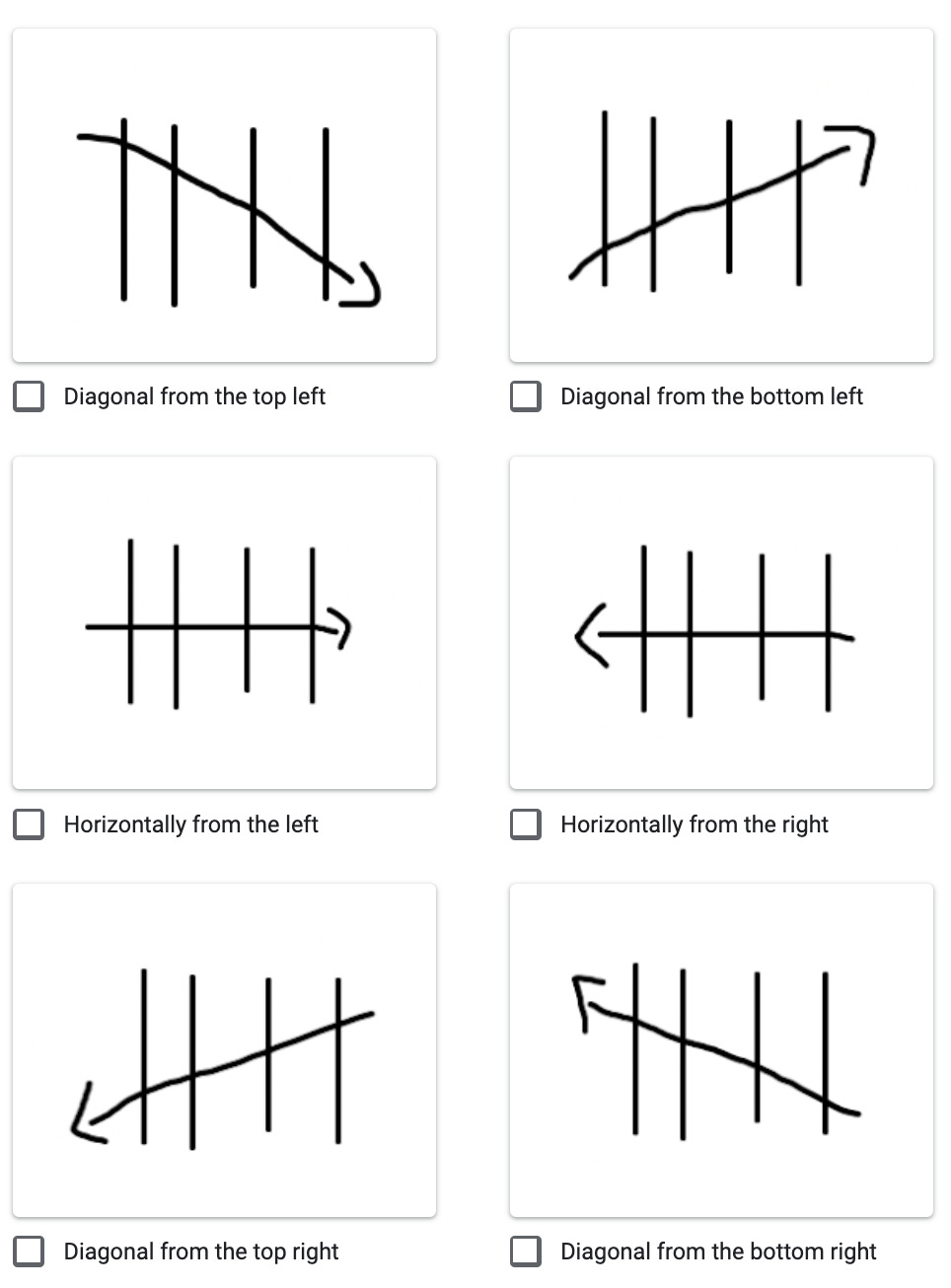
Pretty much everyone (in the western world) draws their tally marks with the same general idea: four vertical, equally-spaced and equal-length lines and then a fifth line that crosses all of them. But there’s substantial heterogeneity in how that fifth line is drawn. Many people draw it from top left to bottom right. Others draw it from bottom left to top right. Some people even draw it from the right side.
So I posted a poll on Reddit. And, after nearly 1,200 responses, I’m ready to share my results. (Note that people could select multiple options)
426 (37%) of the respondents draw theirs diagonally from the top left
392 (34%) of the respondents draw theirs diagonally from the top right
330 (28%) of the respondents draw theirs diagonally from the bottom left
123 (11%) of the respondents draw theirs horizontally from the left
19 (2%) of the respondents draw theirs horizontally from the right
Multiple people wrote in the Chinese character 正, which many East Asian countries use in a similar method to western tally marks
One person wrote in a method using the Star of David, which I have not been able to find any corroboration for online

I also asked for age (skewed toward 18-25 and 26-35, as expected of Reddit) and region of childhood (skewed toward USA and Western Europe).
Performing a chi-squared test for the relationship between tally mark direction and age gave me p=0.999 (i.e., there likely wasn’t one). Performing one between tally mark direction and region gave me p=3.5e-10 (i.e., it’s exceedingly likely that there is one).
Results were robust even after dropping uncommon responses and multiple-option selections. Hence, I decided to, leaving me with 1,028 responses).
Digging into the data a bit, this makes sense. Here are the plots after dropping regions with less than seven responses (sorry to those people!):
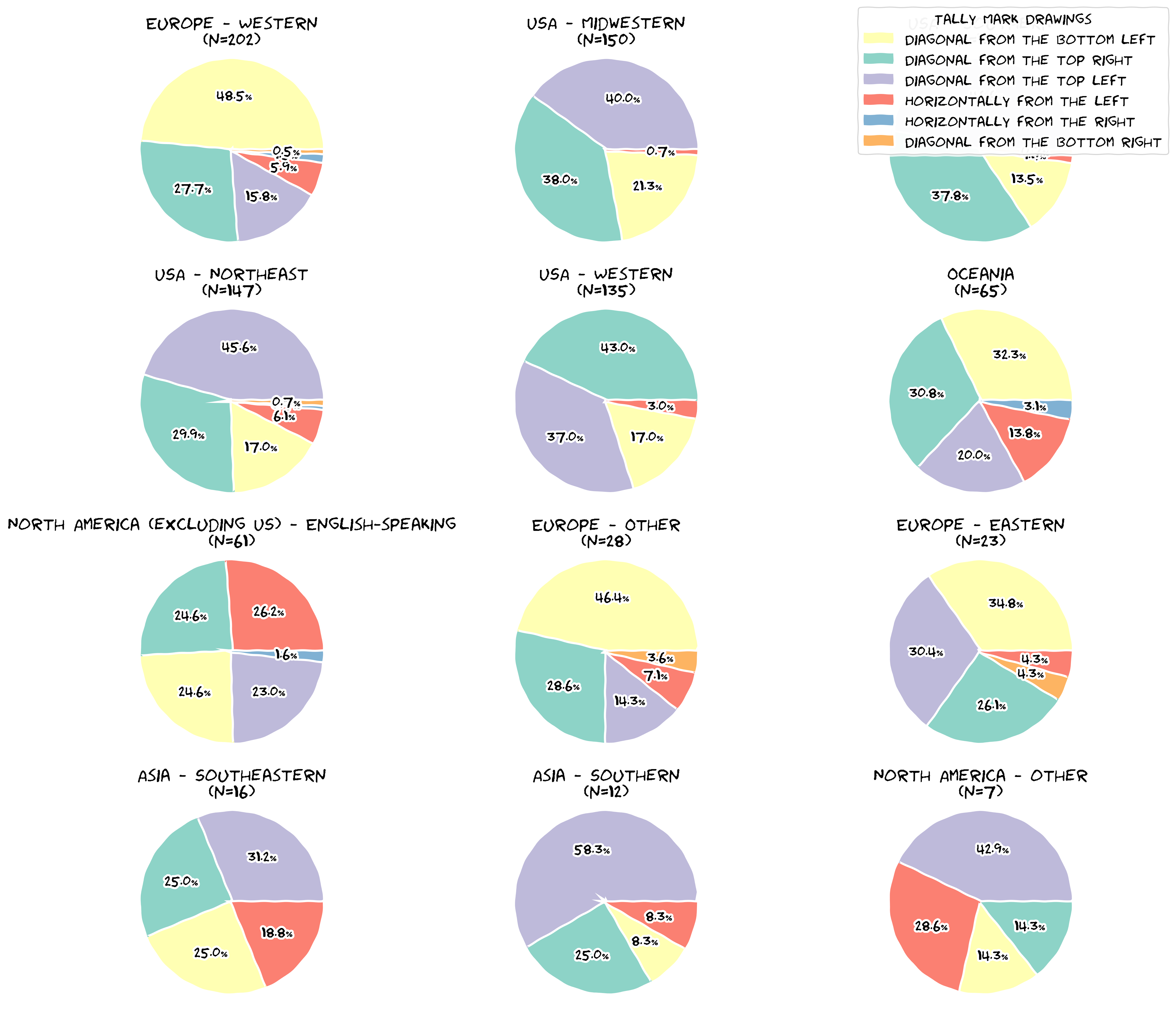
There’s definitely big differences per region. Quick highlights:
Drawing the fifth tally horizontally from the left is pretty common in non-US but English-speaking North America (26%) but is almost nonexistent in the US (with only one respondent in the Midwest)
By far, the rarest choice was drawing the fifth tally horizontally from the right. In fact, across the board, drawing from the right seems to be rarer. This holds even in non-western places, where I expected different writing directions to have influenced the style. Maybe more Middle Eastern responses would’ve shown something interesting?
In retrospect, I definitely wish I had asked more questions (occupation, gender, etc.). My goal was making the survey as painless as possible, but I think I leaned too much on that side vs the amount of questions side.